Prospect search bar
The hero search bar from joinstarlight.com, which types out example prospect searches and recolours its spinning gradient border for each of four modes.
Build a React 19 + TypeScript component called ProspectSearch: a dark search bar that types example prospect searches, with four mode chips that recolour its rotating gradient border, on a twinkling starfield.

Constraints
- One .tsx file, "use client", imports from react only, default export, no required props (optional onSearch(mode, query)). All CSS in a template string rendered as <style href="ui-prospect-search" precedence="ui">, every class prefixed "ps-".
- The root fills its parent: position relative, width/height 100%, overflow hidden, isolation isolate, background #0a0a0f. Respond to its own width with container queries, not the viewport.
- Font: var(--font-google-sans-flex, "Google Sans Flex"), system-ui, sans-serif.

Modes
- Chip label → button text: Buyers → "Find these buyers", Lookalikes → "Find lookalikes", Companies → "Find these companies", Local → "Find local businesses". Give each 3–5 example searches, like "HVAC contractors in Phoenix".
- Colours (base / dark / accent / chip tint): Buyers #2563eb / #1e3a8a / #0098f3 / rgba(37,99,235,.28); Lookalikes #7c3aed / #4c1d95 / #c084fc / rgba(124,58,237,.28); Companies #059669 / #064e3b / #34d399 / rgba(5,150,105,.28); Local #ea580c / #7c2d12 / #fbbf24 / rgba(234,88,12,.28).
- border = linear-gradient(270deg, dark 0%, dark 33%, #000 51%, accent 93%); button = linear-gradient(163deg, base 28%, dark 54%, #000 68%, accent 100%); halo = linear-gradient(163deg, base 20%, dark 50%, accent 100%).
- CSS can't tween gradients, so render every gradient as four stacked absolute layers, one per mode, and crossfade only their opacity (500ms, cubic-bezier(0,0,.2,1)).

Bar
- Centred, max-width 820px with 24px side padding. Wrapper: radius 22px, padding 4px, overflow: clip (hidden makes it a scroller that shifts when the button takes focus). Inside it, a layer at inset −345px −164px holding the border gradients, rotating 360° every 6s linear; only the 4px padding shows it.
- Behind the wrapper, a glow: inset 8px 40px, radius 22px, the border gradients, opacity .3, blur 40px.
- Inner panel: black, radius 18px, padding 16px (12px below 660px), column gap 8px.
- Typed line: 18px/27px, weight 500, white at 80%, min-height 40px; below 660px 15px/22px clamped to exactly 66px. A 2px × 1.2em caret, white at 75%, blinking 1s step-end.
- Typing: 45ms per character, pause 2.5s, delete at 25ms per character, next example. Picking a mode clears the text and starts its first example.
- Bottom row, wrapping: chips fill the space, then the button. Chips: 38px tall (34px narrow), 12px side padding (10px), 14px text (13px), radius 8px, 1px border white at 8%, backdrop blur 6px; active: border white at 20%, weight 500, chip tint; inactive hover: white at 10%.
- Button, same height as the chips, radius 9px, layered: halo (inset −8px, radius 12px, blur 24px, opacity .5→.8 and scale 1→1.05 every 2.5s), the button gradient, a 13px top highlight in the base colour (opacity .6, blur 10px), a black fill inset 1px (radius 7px), then a 16px magnifying-glass icon and the mode's button text. Below 660px the text is just "Find".
- Hover, only where (hover: hover): bar and glow scale 1.02, glow opacity .45, button scale 1.05, 300ms ease-out.
- Click: call onSearch, hold the button at scale 1.05 for 1.2s while the halo flares to scale 1.4 at full opacity and the glow rises to .6, then settle. Ignore repeat clicks meanwhile.

Starfield
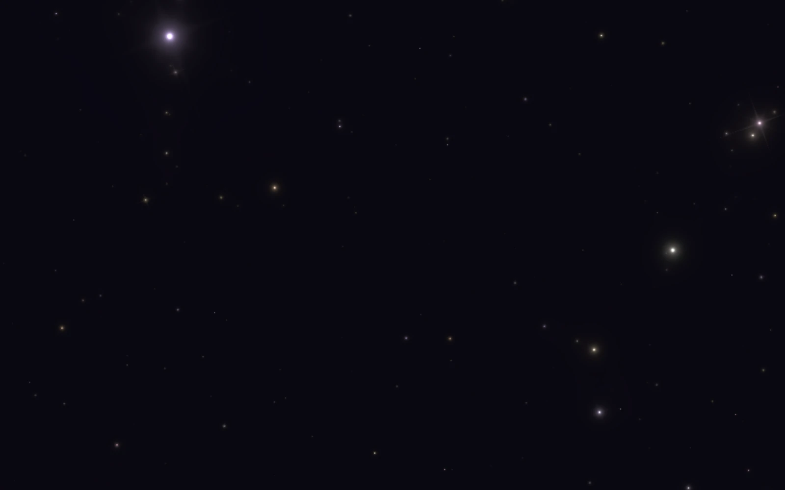
- DOM dots, one per 5,000px², at random % positions, topped up or trimmed by a ResizeObserver: 60% 1px rgba(255,255,255,.5), 30% 2px white, 10% 3px white, each with a soft white glow, pulsing opacity 1→.1→1 over a random 2–5s.

Behaviour
- Chips are buttons with aria-pressed in a role="group" labelled "Search mode"; the button's aria-label is its full text. Visible focus rings. Hide the typed text from screen readers; put the full example in a visually hidden line.
- Pause the typewriter and every CSS animation off screen (IntersectionObserver) and in hidden tabs; clear timers on unmount.
- prefers-reduced-motion: no rotation, pulsing, blinking or scaling, and each example shows in full without typing.
"use client";
/**
* ProspectSearch: the hero search bar from joinstarlight.com, on Starlight's starfield.
*
* From Starlight (joinstarlight.com), where it sits at the bottom of the hero as a picture of the buyers
* Starlight goes and finds for a customer. On the site the button warps to checkout; here it flares for
* 1.2 s and stays put (pass `onSearch` to do something real).
*
* How it works
* - A typewriter cycles the selected mode's example searches: 45 ms per character typed, 25 ms per
* character deleted, 2.5 s pause on the full query. Picking a mode clears it and starts that mode's list.
* - Each of the four modes has its own palette. CSS can't tween between two gradients, so every gradient
* (the rotating border, the glow under the bar, the button's border and its halo) is painted once per
* mode as a stacked layer, and only opacity animates, over 500 ms.
* - The border is an oversized gradient spinning once every 6 s behind the bar, seen through the bar's
* 4 px padding. The wrapper clips it with `overflow: clip`, not `hidden`: `hidden` would make the box a
* scroll container, and focusing the button inside would scroll the gradient sideways.
* - The layout follows the component's own width (a container query). Below 660 px the bar switches to
* its phone sizes and the button reads "Find"; the four chips wrap into two rows on the narrowest frames.
* - The stars are plain DOM dots, one per 5,000 px², in three sizes, each pulsing on its own 2–5 s cycle.
* Animations and the typewriter pause off screen and in hidden tabs. With reduced motion the border and
* stars hold still and the full query shows without typing.
*
* Usage
* <div style={{ height: 360 }}>
* <ProspectSearch onSearch={(mode, query) => console.log(mode, query)} />
* </div>
*
* Requirements: React 19 (for the hoisted <style>), no other dependencies, a browser with container
* queries. Set in Google Sans Flex when the page provides `--font-google-sans-flex`, else the system sans.
*/
import { useEffect, useRef, useState, useSyncExternalStore } from "react";
// ── Copy (identical to the live site) ───────────────────────────────────────────────────────────
const MODES = [
{ id: "leads", label: "Buyers", action: "Find these buyers" },
{ id: "similar", label: "Lookalikes", action: "Find lookalikes" },
{ id: "companies", label: "Companies", action: "Find these companies" },
{ id: "local", label: "Local", action: "Find local businesses" },
] as const;
export type ProspectSearchMode = (typeof MODES)[number]["id"];
const EXAMPLES: Record<ProspectSearchMode, readonly string[]> = {
leads: [
"Founders of seed-stage SaaS companies in Austin",
"Heads of operations at 50 to 200 person logistics firms",
"Marketing directors at e-commerce brands that just hired a sales lead",
"CTOs at fintech startups hiring their first security engineer",
"Owners of boutique agencies that added a new service line this year",
],
similar: [
"More buyers like our best customer: a RevOps lead at a 200 person SaaS company",
"People like the last three deals we closed in healthtech",
"Companies that look like our top ten accounts",
],
companies: [
"B2B SaaS companies with 50 to 200 employees in the US",
"Climate tech companies that raised a Series A in the last year",
"Consumer brands with 100 to 500 employees in Los Angeles",
"Professional services firms opening a second office",
],
local: [
"Dental practices in Denver with more than one location",
"HVAC contractors in Phoenix",
"Med spas in Scottsdale",
"Roofing companies in Tampa",
],
};
/**
* Per-mode palette. `border` paints the rotating border and the glow beneath the bar, `button` the
* button's 1px gradient border, `buttonGlow` the halo around it, `topGlow` its inner highlight, and
* `pill` tints the active mode chip.
*/
const MODE_THEMES: Record<
ProspectSearchMode,
{ border: string; button: string; buttonGlow: string; topGlow: string; pill: string }
> = {
leads: {
border: "linear-gradient(270deg, #1e3a8a 0%, #1e3a8a 33%, #000 51%, #0098f3 93%)",
button: "linear-gradient(163deg, #2563eb 28%, #1e3a8a 54%, #000 68%, #0098f3 100%)",
buttonGlow: "linear-gradient(163deg, #2563eb 20%, #1e3a8a 50%, #0098f3 100%)",
topGlow: "#2563eb",
pill: "rgba(37, 99, 235, 0.28)",
},
similar: {
border: "linear-gradient(270deg, #4c1d95 0%, #4c1d95 33%, #000 51%, #c084fc 93%)",
button: "linear-gradient(163deg, #7c3aed 28%, #4c1d95 54%, #000 68%, #c084fc 100%)",
buttonGlow: "linear-gradient(163deg, #7c3aed 20%, #4c1d95 50%, #c084fc 100%)",
topGlow: "#7c3aed",
pill: "rgba(124, 58, 237, 0.28)",
},
companies: {
border: "linear-gradient(270deg, #064e3b 0%, #064e3b 33%, #000 51%, #34d399 93%)",
button: "linear-gradient(163deg, #059669 28%, #064e3b 54%, #000 68%, #34d399 100%)",
buttonGlow: "linear-gradient(163deg, #059669 20%, #064e3b 50%, #34d399 100%)",
topGlow: "#059669",
pill: "rgba(5, 150, 105, 0.28)",
},
local: {
border: "linear-gradient(270deg, #7c2d12 0%, #7c2d12 33%, #000 51%, #fbbf24 93%)",
button: "linear-gradient(163deg, #ea580c 28%, #7c2d12 54%, #000 68%, #fbbf24 100%)",
buttonGlow: "linear-gradient(163deg, #ea580c 20%, #7c2d12 50%, #fbbf24 100%)",
topGlow: "#ea580c",
pill: "rgba(234, 88, 12, 0.28)",
},
};
// ── Timing ──────────────────────────────────────────────────────────────────────────────────────
const TYPE_SPEED = 45;
const DELETE_SPEED = 25;
const PAUSE_DURATION = 2500;
const SEARCH_FLARE_MS = 1200; // how long the button holds its pressed, brighter state
const PIXEL_DENSITY = 5000; // one star per this many px²
// ── Styles ──────────────────────────────────────────────────────────────────────────────────────
const css = `
.ps-root {
--ps-ease: cubic-bezier(0, 0, 0.2, 1);
container: ps / inline-size;
position: relative;
width: 100%;
height: 100%;
overflow: hidden;
isolation: isolate;
background: #0a0a0f;
color: #fff;
font-family: var(--font-google-sans-flex, "Google Sans Flex"), system-ui, sans-serif;
font-size: 16px;
line-height: 1.5;
text-align: left;
-webkit-font-smoothing: antialiased;
-moz-osx-font-smoothing: grayscale;
}
.ps-root *, .ps-root *::before, .ps-root *::after { box-sizing: border-box; }
/* Starfield */
.ps-stars { position: absolute; inset: 0; overflow: hidden; pointer-events: none; }
.ps-star { position: absolute; border-radius: 50%; }
.ps-star-sm { width: 1px; height: 1px; background: rgba(255, 255, 255, 0.5); box-shadow: 0 0 3px 1px rgba(255, 255, 255, 0.15); }
.ps-star-md { width: 2px; height: 2px; background: #fff; box-shadow: 0 0 6px 1px rgba(255, 255, 255, 0.35); }
.ps-star-lg { width: 3px; height: 3px; background: #fff; box-shadow: 0 0 10px 3px rgba(255, 255, 255, 0.5); }
/* The bar: centred; on wide frames its top is pinned so a query wrapping to a second line grows it downward */
.ps-bar {
position: absolute;
z-index: 1;
top: 50%;
left: 0;
right: 0;
max-width: 820px;
margin: 0 auto;
padding: 0 24px;
transform: translateY(-50%);
}
.ps-layer {
position: absolute;
inset: 0;
border-radius: inherit;
pointer-events: none;
transition: opacity 500ms var(--ps-ease);
}
.ps-glow {
position: absolute;
inset: 8px 40px;
border-radius: 22px;
opacity: 0.3;
filter: blur(40px);
pointer-events: none;
transition: transform 300ms var(--ps-ease), opacity 300ms var(--ps-ease);
}
/* The 4px padding is the border. clip, not hidden: see the header comment. */
.ps-frame {
position: relative;
overflow: hidden;
overflow: clip;
border-radius: 22px;
padding: 4px;
transition: transform 300ms var(--ps-ease);
}
.ps-spin { position: absolute; inset: -345px -164px; pointer-events: none; will-change: transform; }
.ps-inner {
position: relative;
display: flex;
flex-direction: column;
gap: 8px;
padding: 12px;
border-radius: 18px;
background: #000;
}
/* Typewriter. On phones the clamp is exactly three 22px lines. */
.ps-type { margin-top: 4px; min-height: 66px; max-height: 66px; overflow: hidden; }
.ps-text { margin: 0; font-size: 15px; font-weight: 500; line-height: 22px; color: rgba(255, 255, 255, 0.8); }
.ps-caret {
display: inline-block;
width: 2px;
height: 1.2em;
margin-left: 1px;
background: rgba(255, 255, 255, 0.75);
transform: translateY(2px);
}
/* Mode chips + button */
.ps-row { display: flex; flex-wrap: wrap; align-items: center; gap: 8px; }
.ps-chips { display: flex; flex: 1 1 0%; flex-wrap: wrap; align-items: center; gap: 8px; }
.ps-chip {
appearance: none;
display: inline-flex;
align-items: center;
height: 34px;
margin: 0;
padding: 0 10px;
border: 1px solid rgba(255, 255, 255, 0.08);
border-radius: 8px;
background-color: transparent;
color: #fff;
font: inherit;
font-size: 13px;
cursor: pointer;
user-select: none;
-webkit-user-select: none;
-webkit-tap-highlight-color: transparent;
-webkit-backdrop-filter: blur(6px);
backdrop-filter: blur(6px);
transition: color 150ms, background-color 150ms, border-color 150ms;
transition-timing-function: cubic-bezier(0.4, 0, 0.2, 1);
}
.ps-chip[aria-pressed="true"] { border-color: rgba(255, 255, 255, 0.2); font-weight: 500; }
.ps-go {
appearance: none;
position: relative;
display: inline-flex;
margin: 0;
padding: 0;
border: 0;
border-radius: 9px;
background: none;
color: #fff;
font: inherit;
overflow: visible;
cursor: pointer;
-webkit-tap-highlight-color: transparent;
transition: transform 300ms var(--ps-ease);
}
.ps-go-glow {
position: absolute;
inset: -8px;
border-radius: 12px;
opacity: 0.5;
filter: blur(24px);
pointer-events: none;
}
.ps-go-face { position: relative; display: inline-flex; height: 34px; overflow: hidden; border-radius: 9px; }
.ps-go-top {
position: absolute;
top: 1px;
left: 0;
right: 0;
height: 13px;
border-radius: 9999px;
opacity: 0.6;
filter: blur(10px);
transition: background-color 500ms var(--ps-ease), opacity 300ms var(--ps-ease);
}
.ps-go-fill { position: absolute; inset: 1px; border-radius: 7px; background: #000; }
.ps-go-label {
position: relative;
z-index: 1;
display: inline-flex;
align-items: center;
gap: 6px;
height: 100%;
padding: 0 10px;
font-size: 13px;
white-space: nowrap;
}
.ps-go-icon { width: 16px; height: 16px; flex-shrink: 0; }
.ps-go-long { display: none; }
.ps-chip:focus-visible, .ps-go:focus-visible { outline: 2px solid rgba(255, 255, 255, 0.85); outline-offset: 2px; }
.ps-sr {
position: absolute;
width: 1px;
height: 1px;
margin: -1px;
padding: 0;
overflow: hidden;
clip: rect(0, 0, 0, 0);
white-space: nowrap;
border: 0;
}
/* Wide frames: the desktop sizes. The resting bar is 130px tall, so its top sits 65px above centre. */
@container ps (min-width: 660px) {
.ps-bar { transform: translateY(-65px); }
.ps-inner { padding: 16px; }
.ps-type { min-height: 40px; max-height: none; overflow: visible; }
.ps-text { font-size: 18px; line-height: 27px; }
.ps-row { column-gap: 15px; row-gap: 11px; }
.ps-chip { height: 38px; padding: 0 12px; font-size: 14px; line-height: 20px; }
.ps-go-face { height: 38px; }
.ps-go-label { padding: 0 12px; font-size: 14px; line-height: 20px; }
.ps-go-short { display: none; }
.ps-go-long { display: inline; }
}
/* Hover (real pointers only, so a tap doesn't leave it stuck) */
@media (hover: hover) {
.ps-bar:hover .ps-glow { opacity: 0.45; }
.ps-chip:not([aria-pressed="true"]):hover { background-color: rgba(255, 255, 255, 0.1); }
}
/* Searching: the button holds its pressed state and everything glows brighter */
.ps-bar[data-searching] .ps-glow { opacity: 0.6; }
.ps-bar[data-searching] .ps-go-top { opacity: 1; }
.ps-bar[data-searching] .ps-go-glow { opacity: 0.9; }
/* Motion, only for people who haven't asked for less */
@media (prefers-reduced-motion: no-preference) {
.ps-star { animation: ps-star-pulse 3s infinite; }
.ps-spin { animation: ps-border-rotate 6s linear infinite; }
.ps-caret { animation: ps-cursor-blink 1s step-end infinite; }
.ps-go-glow { animation: ps-send-glow 2.5s ease-in-out infinite; }
.ps-bar[data-searching] .ps-go { transform: scale(1.05); }
.ps-bar[data-searching] .ps-go-glow { animation: ps-search-flare ${SEARCH_FLARE_MS}ms cubic-bezier(0.2, 0.7, 0.2, 1) both; }
}
@media (hover: hover) and (prefers-reduced-motion: no-preference) {
.ps-bar:hover .ps-glow, .ps-bar:hover .ps-frame { transform: scale(1.02); }
.ps-go:hover { transform: scale(1.05); }
}
/* Off screen or in a hidden tab: freeze every animation */
.ps-root[data-paused], .ps-root[data-paused] * { animation-play-state: paused; }
@keyframes ps-border-rotate { from { transform: rotate(0deg); } to { transform: rotate(360deg); } }
@keyframes ps-send-glow {
0%, 100% { opacity: 0.5; transform: scale(1); }
50% { opacity: 0.8; transform: scale(1.05); }
}
@keyframes ps-search-flare {
0% { opacity: 0.8; transform: scale(1.05); }
25% { opacity: 1; transform: scale(1.4); }
100% { opacity: 0.5; transform: scale(1); }
}
@keyframes ps-cursor-blink { 0%, 100% { opacity: 1; } 50% { opacity: 0; } }
@keyframes ps-star-pulse { 0%, 100% { opacity: 1; } 50% { opacity: 0.1; } }
`;
// ── Helpers ─────────────────────────────────────────────────────────────────────────────────────
const REDUCED_MOTION = "(prefers-reduced-motion: reduce)";
function subscribeReducedMotion(onChange: () => void) {
const mq = window.matchMedia(REDUCED_MOTION);
mq.addEventListener("change", onChange);
return () => mq.removeEventListener("change", onChange);
}
function useReducedMotion() {
return useSyncExternalStore(
subscribeReducedMotion,
() => window.matchMedia(REDUCED_MOTION).matches,
() => false,
);
}
/** One layer per mode, all stacked; only the active one is opaque, so switching modes crossfades. */
function GradientStack({
mode,
layer,
radius,
}: {
mode: ProspectSearchMode;
layer: "border" | "button" | "buttonGlow";
radius?: number;
}) {
return (
<>
{MODES.map(({ id }) => (
<span
key={id}
className="ps-layer"
style={{
background: MODE_THEMES[id][layer],
opacity: id === mode ? 1 : 0,
borderRadius: radius,
}}
aria-hidden="true"
/>
))}
</>
);
}
function SearchIcon() {
return (
<svg className="ps-go-icon" viewBox="0 0 24 24" fill="none" aria-hidden="true" focusable="false">
<g
transform="translate(2, 2)"
stroke="currentColor"
strokeWidth="1.5"
strokeLinecap="round"
strokeLinejoin="round"
>
<circle cx="9.76659044" cy="9.76659044" r="8.9885584" />
<line x1="16.0183067" y1="16.4851259" x2="19.5423342" y2="20.0000001" />
</g>
</svg>
);
}
// ── Component ───────────────────────────────────────────────────────────────────────────────────
type ProspectSearchProps = {
/** Called when the button is pressed, with the active mode and the query it's showing. */
onSearch?: (mode: ProspectSearchMode, query: string) => void;
};
export default function ProspectSearch({ onSearch }: ProspectSearchProps) {
const rootRef = useRef<HTMLDivElement>(null);
const starsRef = useRef<HTMLDivElement>(null);
const flareTimer = useRef<ReturnType<typeof setTimeout> | null>(null);
const [mode, setMode] = useState<ProspectSearchMode>("leads");
const [displayText, setDisplayText] = useState("");
const [queryIndex, setQueryIndex] = useState(0);
const [isDeleting, setIsDeleting] = useState(false);
const [searching, setSearching] = useState(false);
const [onScreen, setOnScreen] = useState(true);
const [tabVisible, setTabVisible] = useState(
() => typeof document === "undefined" || document.visibilityState === "visible",
);
const reducedMotion = useReducedMotion();
const active = onScreen && tabVisible;
const queries = EXAMPLES[mode];
const currentQuery = queries[queryIndex] ?? queries[0];
const actionLabel = MODES.find((m) => m.id === mode)?.action ?? MODES[0].action;
// Typewriter: type the query, hold it, delete it, move to the next one.
useEffect(() => {
if (reducedMotion || !active) return;
if (!isDeleting && displayText === currentQuery) {
const timeout = setTimeout(() => setIsDeleting(true), PAUSE_DURATION);
return () => clearTimeout(timeout);
}
const timeout = setTimeout(
() => {
if (isDeleting) {
const next = displayText.slice(0, -1);
setDisplayText(next);
// Finished deleting: advance to the next query.
if (next === "") {
setIsDeleting(false);
setQueryIndex((prev) => (prev + 1) % queries.length);
}
} else {
setDisplayText(currentQuery.slice(0, displayText.length + 1));
}
},
isDeleting ? DELETE_SPEED : TYPE_SPEED,
);
return () => clearTimeout(timeout);
}, [displayText, isDeleting, currentQuery, queries.length, active, reducedMotion]);
// Pause everything off screen and in hidden tabs.
useEffect(() => {
const root = rootRef.current;
if (!root) return;
const io = new IntersectionObserver(([entry]) => setOnScreen(entry.isIntersecting));
io.observe(root);
const onVisibility = () => setTabVisible(document.visibilityState === "visible");
document.addEventListener("visibilitychange", onVisibility);
return () => {
io.disconnect();
document.removeEventListener("visibilitychange", onVisibility);
};
}, []);
// The starfield: DOM dots at one per 5,000px², topped up or trimmed as the frame resizes.
useEffect(() => {
const field = starsRef.current;
if (!field) return;
const stars: HTMLSpanElement[] = [];
const sync = () => {
const target = Math.floor((field.clientWidth * field.clientHeight) / PIXEL_DENSITY);
while (stars.length < target) {
const star = document.createElement("span");
const roll = Math.random();
star.className = `ps-star ${roll < 0.6 ? "ps-star-sm" : roll < 0.9 ? "ps-star-md" : "ps-star-lg"}`;
star.style.left = `${Math.random() * 100}%`;
star.style.top = `${Math.random() * 100}%`;
star.style.animationDuration = `${2 + Math.random() * 3}s`;
field.appendChild(star);
stars.push(star);
}
while (stars.length > target) stars.pop()?.remove();
};
sync();
const ro = new ResizeObserver(sync);
ro.observe(field);
return () => {
ro.disconnect();
stars.forEach((star) => star.remove());
};
}, []);
useEffect(
() => () => {
if (flareTimer.current) clearTimeout(flareTimer.current);
},
[],
);
const selectMode = (next: ProspectSearchMode) => {
if (next === mode) return;
setMode(next);
setDisplayText("");
setQueryIndex(0);
setIsDeleting(false);
};
const search = () => {
if (searching) return;
onSearch?.(mode, currentQuery);
setSearching(true);
flareTimer.current = setTimeout(() => setSearching(false), SEARCH_FLARE_MS);
};
const shownText = reducedMotion ? currentQuery : displayText;
return (
<div ref={rootRef} className="ps-root" data-paused={active ? undefined : ""}>
<style href="ui-prospect-search" precedence="ui">
{css}
</style>
<div ref={starsRef} className="ps-stars" aria-hidden="true" />
<div className="ps-bar" data-searching={searching ? "" : undefined}>
{/* Glow beneath the bar */}
<div className="ps-glow" aria-hidden="true">
<GradientStack mode={mode} layer="border" />
</div>
<div className="ps-frame">
{/* Rotating gradient, far larger than the bar; only the edge shows through the 4px padding */}
<div className="ps-spin" aria-hidden="true">
<GradientStack mode={mode} layer="border" />
</div>
<div className="ps-inner">
<div className="ps-type">
<p className="ps-text" aria-hidden="true">
{shownText}
<span className="ps-caret" />
</p>
<p className="ps-sr">Example search: {currentQuery}</p>
</div>
<div className="ps-row">
<div className="ps-chips" role="group" aria-label="Search mode">
{MODES.map(({ id, label }) => {
const isActive = id === mode;
return (
<button
key={id}
type="button"
className="ps-chip"
onClick={() => selectMode(id)}
aria-pressed={isActive}
style={isActive ? { backgroundColor: MODE_THEMES[id].pill } : undefined}
>
{label}
</button>
);
})}
</div>
<button type="button" className="ps-go" onClick={search} aria-label={actionLabel}>
<span className="ps-go-glow" aria-hidden="true">
<GradientStack mode={mode} layer="buttonGlow" />
</span>
<span className="ps-go-face">
<GradientStack mode={mode} layer="button" radius={8} />
<span
className="ps-go-top"
style={{ backgroundColor: MODE_THEMES[mode].topGlow }}
aria-hidden="true"
/>
<span className="ps-go-fill" aria-hidden="true" />
<span className="ps-go-label">
<SearchIcon />
{/* Narrow frames get the bare verb; the active chip already names the mode. */}
<span className="ps-go-short">Find</span>
<span className="ps-go-long">{actionLabel}</span>
</span>
</span>
</button>
</div>
</div>
</div>
</div>
</div>
);
}