Why visual design matters
Apr 20, 2025
First impressions matter: people evaluate products based on their visual appeal. When you launch a new app or product, users form opinions before they even understand its functionality. Their judgment hinges not on features or specifications, but on design. That initial glance—often just a fleeting moment—can determine whether they pause to explore or simply move on.
Think about how this works. You’re not just competing with other products; you’re competing with everything else vying for attention. Notifications, ads, a million other tabs. In that mess, good visual design isn’t just nice to have. It’s the thing that makes someone pause. It’s the hook that says, “Hey, this might be worth a second of your day.”
Presentation isn’t just decoration
Now, let’s dig into why this happens. Presentation matters because it’s the first signal. Imagine you’ve got five seconds to convince someone to give you a minute. They’re not going to read a wall of text about your product’s benefits. They’re not even going to click a link. What they’ll do is look at it. They’ll scan the design for clues. Does it look polished? Does it feel intentional? If it doesn’t, they’re gone.
This isn’t about tricking people. It’s about meeting them where they are. Humans are visual creatures. We’ve been wired to make snap judgments based on what we see since long before apps or websites existed. A product that looks sloppy signals it might not work well. A product that looks sharp suggests it’s been thought through. That’s not always true, of course, but it’s the instinct we’re up against.
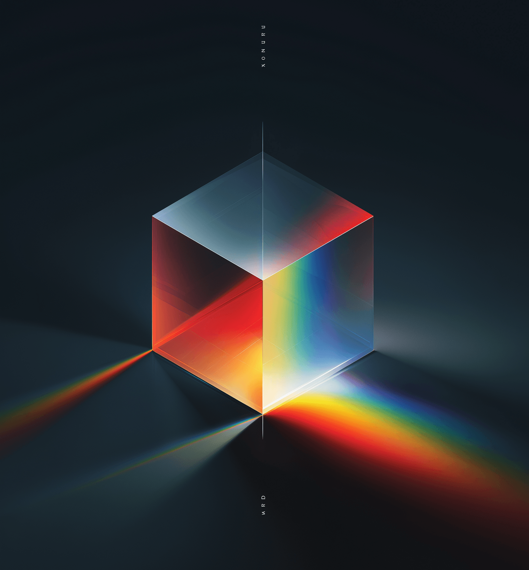
The power of style
So what makes a design signal the right things? It’s not just about looking pretty. Visual design communicates on a level deeper than words. It’s subconscious. Before someone reads your pitch or hears your story, they feel something about your product. Trust, maybe. Or skepticism. And that feeling comes from the care put into the design. Every detail—color, spacing, typography—adds up to a message. Done right, it says, “We sweated the small stuff. This is for you.”
Style plays a big role here. Style isn’t just decoration; it’s meaning. It’s what gives your product a personality. A minimalist design might say “simple and reliable.” A bold, colorful one might say “fun and creative.” The point isn’t to pick a style everyone likes—that’s impossible. The point is to pick one that speaks to the people you’re trying to reach. Style turns a generic product into something with purpose.
Building a following through design
Here’s another angle: great visual design can turn users into fans. Building loyalty isn’t easy, but one way to do it is by creating a brand that stands out visually. Not just for looking good, but for what that look represents. People don’t buy products; they buy feelings. They buy values. They buy promises. A product with a strong visual identity doesn’t just sit there—it connects. It’s not about whether the design is “beautiful” in some abstract way. It’s about who it resonates with. Every product has an audience. The question is, does your design start a conversation with them?
Look at companies that get this right. Their design isn’t random. It’s consistent, deliberate, and tied to what they stand for. That consistency builds trust over time. It’s not just a logo or a color scheme; it’s a signal that says, “We’re still us. You can count on us.” That’s how you get people coming back.
Telling a story visually
But design isn’t just about the first impression. It’s also about telling a story. Beyond the initial look, a good narrative can make your product unforgettable. Why does this thing exist? What problem does it solve? How does it solve it? When you explain that, you’re not just showing off a pretty interface—you’re pulling people in. You’re giving them a reason to care.
This is where visuals like mockups come in. Words can describe a solution, but mockups show it. They let people see themselves using your product. They make the abstract real. Imagine someone struggling with a problem, then seeing your product in action through a well-crafted mockup. Suddenly, they’re not just reading about a fix; they’re picturing it. That’s powerful. It’s not just telling a story—it’s letting them live it for a moment.
Design as the gateway to utility
Let’s wrap this up with a final thought. The utility of a product—how well it works—matters a lot. No one’s arguing otherwise. But utility doesn’t get a chance to shine if no one notices the product in the first place. Visual design is the gateway. It’s what grabs attention in a crowded world. It’s what makes someone stop long enough to care about what your product does.
In today’s marketplace, blending in is death. There are too many options, too many distractions. Your product needs to stand out, not just as something useful, but as something worth looking at. Good design does that. It signals quality. It builds trust. It starts the conversation. And if you get that right, the rest-features, functionality, all of it-has a chance to matter.
Spencer Camp